Cracker Barrel Reverts to Beloved Logo

Introduction
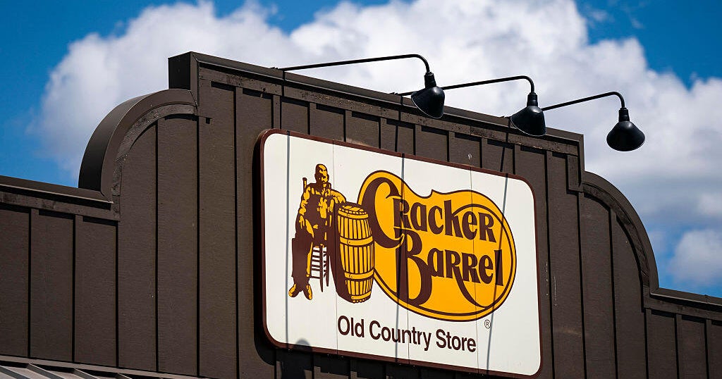
Last week, Cracker Barrel announced that it was changing its logo to remove the image of a man sitting in a chair leaning against a barrel, and replacing it with a logo that only featured the chain's name. This decision sparked backlash from loyal customers and fans of the iconic logo. As a result, Cracker Barrel has decided to return to its old logo, which has been a beloved symbol for the company since its founding in 1969.
Reason for Change
The original decision to change the logo was made in an effort to modernize the brand and make it more inclusive. However, many customers felt that the change was unnecessary and took away from the charm and nostalgia of the original logo. In today's fast-paced and ever-changing world, it's not uncommon for companies to update their branding to stay relevant. However, it's important for companies to remember the value of tradition and the connection it creates with their audience.
The Power of Branding
The return to the old logo is a testament to the power of branding. The image of the man sitting in a rocking chair has become synonymous with Cracker Barrel and evokes feelings of comfort and home. This is a prime example of the impact that a well-crafted and memorable logo can have on a company's success. It's a reminder for businesses to carefully consider any changes to their branding and the
About the Organizations Mentioned
Cracker Barrel
Cracker Barrel Old Country Store, founded in 1969 by Dan Evins and Tommy Lowe in Lebanon, Tennessee, is a distinctive American restaurant and retail chain that combines Southern cuisine with nostalgic country store shopping[1][4][7]. Originating as a roadside establishment designed to serve weary interstate travelers, the first location was strategically placed near Interstate 40 to offer food, fellowship, and gasoline, initially supporting Evins’ family oil business[1][3][4]. The name "Cracker Barrel" harks back to traditional Southern country stores where people gathered around barrels of soda crackers to chat, symbolizing community and hospitality[1][2]. The concept merged a sit-down restaurant serving Southern staples like biscuits, grits, country ham, and turnip greens with a retail store selling Americana-themed goods and antiques curated by specialists, enhancing the nostalgic experience[2][4]. While Cracker Barrel initially included gas pumps, the oil embargo in the mid-1970s prompted the company to focus solely on food and retail services[1][3]. The brand expanded steadily through the 1970s and 1980s, capitalizing on America’s growing interstate highway system and the desire for consistent, welcoming roadside stops. By 1981, Cracker Barrel went public, and through the 1980s and 1990s, it achieved rapid growth, outperforming competitors with efficient operations and strong revenue per square foot[5]. Its iconic logo featuring "Uncle Herschel," inspired by founder Evins' uncle, and the signature front porch rocking chairs have become emblematic of the brand’s commitment to tradition and comfort[1][5]. Today, Cracker Barrel operates over 660 locations in 45 states, serving more than 230 million guests annually, embodying a successful blend of hospitality, retail, and Southern culture[3][7]. It remains headquartered in Lebanon, Tennessee, and as of 2024, reported revenues around $


